

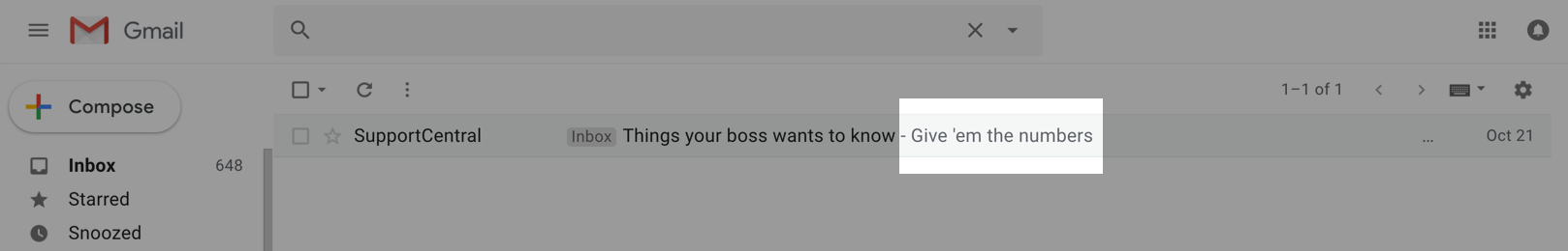
In Klaviyo / MailChimp / Whatever software you're using, make sure your preview text shows the benefit of the email. Make it short, actionable, and most of all, easy to read on a mobile phone, which is where most customers will be reading it.
It's one of the first things customers will see when they look at the email, and usually make a decision about whether or not to read it. It's the part that is shown alongside or (on mobile) underneath the subject line:
Desktop:
Mobile:

This can be the difference between "DELETE" or "Hmm, I might read this". Especially if a discount code is involved - for an abandoned cart email, for example - make sure you include that in the preview text. It's the only hint a customer has about what's in the email - make it good.
EXAMPLES
Bad:
"View in Your Browser" -
It doesn't explain what's in the email, and isn't enticing.
Good:

"Don't worry - we've saved your cart!"
Much better - it now says what the email is about and is enticing.